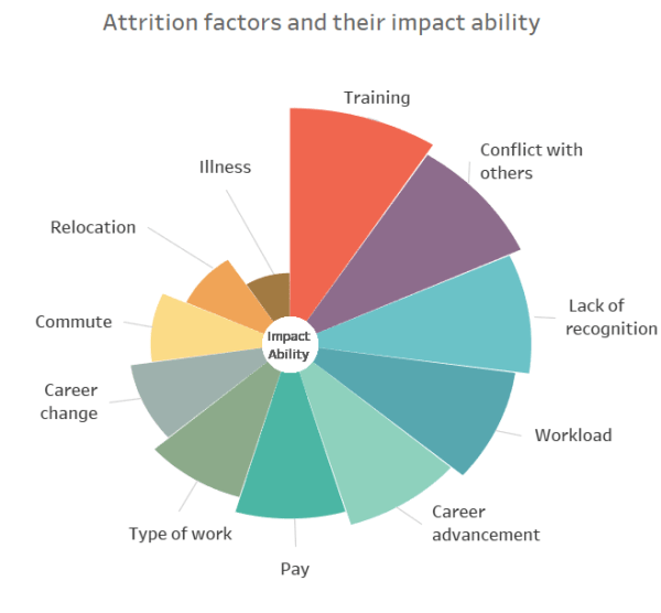
What is a Polar Area Chart? An example of Polar Area Chart in Tableau Polar Area Chart or Coxcomb chart looks similar to Pie chart, however the angle of all the slices are equal and the length of the slice that extends radially from the center represent quantity. Lets start building the Chart! Download the Data.... Continue Reading →
-
Subscribe
Subscribed
Already have a WordPress.com account? Log in now.
