What is a Polar Area Chart?

Polar Area Chart or Coxcomb chart looks similar to Pie chart, however the angle of all the slices are equal and the length of the slice that extends radially from the center represent quantity.
Lets start building the Chart! Download the Data.
Data source: https://community.storytellingwithdata.com/exercises/whats-the-story-here
(Please note that a polar chart might not be the best visualization to represent the given data)
Understanding the Data and Design:
There are 11 records in the data set. Each corresponds to a Factor causing attrition .As the name suggests, the column Ability to impact shows how each Factor contributes to attrition. Each sector in the chart corresponds to a Factor and the length of the sector corresponds to Ability to impact.
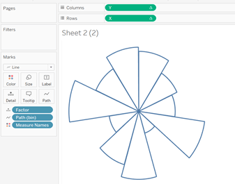
I first created the outline of the sectors ([Factor]) and then converted the Marks from Line to Polygon.
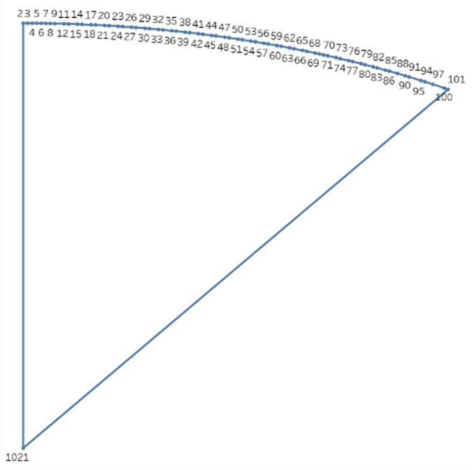
Lets take a closer look at each Sector. Each Sector is made of 102 points. Point 1 and point 102 are plotted at center XY coordinate (0,0). Rest of the point make up the arc.
To get all these points we need to create
1. A field [Path] with values 1 and 102.
2. Create a path bin with step size 1.
3. Create a field to hold index() computed along the path bin.
Step 1: Union the data with itself so that we can have two values for [Path] for each [Factor].
Step 2: Create calculated field [Path]
if [Table Name]=’Attrition Factors’
then 1
else 102
END
Step 3: Create path bin with size 1
Step 4: create calculated field [Index].
index()
Now we need to calculate the Angle, Radius and (X,Y)coordinates for each point .
The X and Y coordinates along the arc is calculated using the equation of a point on the path of a circle.
Any point (X,Y) on the path of the circle is x = Radius*sin(Angle), y = Radius*cos(Angle)
Step 5: Radius is proportional to [Ability to impact]
Create calculated field [Radius]
sqrt([Ability to impact])
Angle
We need to find the angle at which the point 2 for each [Factor] has to be plotted.(Starting angle of each sector)
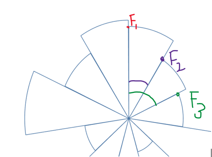
Eg: For point F1 the angle is 0,for point F2 the angle is equivalent to angle of one sector
For F3 angle is equivalent to 2*Angle of one sector.
Angle for each sector is 360/11 or 2*pi()/11 (there are 11 factors in the dataset)
Step 6:
Create a calculated field [edges]
index() \\ this has to be computed along [Factor] so max value for this will be 11 in our dataset.
Create a calculated Field [Angle]
([edges]-1)*(2*PI()/11) //this will give the angle at which each Sector starts
Create calculated Field [X]
IIF([index]=1 OR [index]=WINDOW_MAX([index]),0,WINDOW_MAX(max([Radius]))* SIN([Angle]+((([index]-2)*WINDOW_MAX(2*PI())/(11*100)))))
Create calculated field [Y]
IIF([index]=1 OR [index]=WINDOW_MAX([index]),0,WINDOW_MAX(max([Radius]))* COS([Angle]+((([index]-2)*WINDOW_MAX(2*PI())/(11*100)))))
Step 8:
Drag [Path (bin)] on to rows and ‘Show Missing Values’.
Drag [X] to columns and [Y] to rows
Set compute using [Path (bin)] for[X] and [Y].
Step 9:
Change Marks type to Line. Drag [Path (bin)] from the row shelf to path in Marks card.
Drag [Factor] to color in Marks card.

Step 10:
Click on [X] edit table calculation
And set the following
In Nested Calculation:
[X] and [index] compute using [Path(bin)]
[edges] compute using [Factor]
Repeat the same for [Y]
Step 11:
Change the Marks type to Polygon from Line
AND NOW……………….
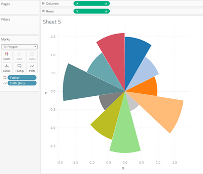
Hide the headers and do the necessary formatting….
I tried creating the chart using plotly in python. Checkout the code
import plotly.graph_objects as go
import plotly.express as pxr=[1, 2, 3, 4, 5, 6,7,8,9,10,11]
labels = ["Illness", "Relocation", "Commute", "Career Change", "Type of Work","Pay","Career Advancement","Workload",
"Lack of Recognition","Conflict with Others","Training"]
num_slices = len(r)
theta = [(i+0.5) * 360 / num_slices for i in range(num_slices)]
width = [360 / num_slices for _ in range(num_slices)]
color_seq = px.colors.qualitative.Vivid
color_indices = range(0, len(color_seq), len(color_seq) // 11 )
colors = [color_seq[i] for i in color_indices]barpolar_plots = [go.Barpolar(r=[r], theta=[t], width=[w], name=n, marker_color=[c],hovertemplate=n)
for r, t, w, n, c in zip(r, theta, width, labels, colors)]fig = go.Figure(barpolar_plots)
fig.update_layout(
template=None,
title="Attrition factors and their Impact ability",
polar = dict(
radialaxis = dict(showgrid=False,showline=False,range=[0, 11], showticklabels=False, ticks=''),
angularaxis = dict(showgrid=False,showline=False,showticklabels=False, ticks=''))
)
fig.show()

Leave a comment