A brief on how I made the viz, learnings and techniques used. I really love reading about Space. Hence I created this viz out of personal interest. There are few interesting visualizations out there which has the same info. I wanted the viz to be interactive and also kind of show each mission as a... Continue Reading →
Curved Bump Chart in Tableau
A bump chart is useful to see how value of a particular dimension changes with respect to other dimension over time. It more effective when the value being tracked or compared is Rank. A bump chart is usually like a line chart, but when there are too many crossing its not so appealing. Hence the... Continue Reading →
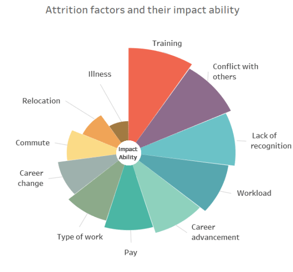
Polar Area Chart in Tableau
What is a Polar Area Chart? An example of Polar Area Chart in Tableau Polar Area Chart or Coxcomb chart looks similar to Pie chart, however the angle of all the slices are equal and the length of the slice that extends radially from the center represent quantity. Lets start building the Chart! Download the Data.... Continue Reading →


